Here we can show different images in the homepage carousel depending on the width of device and to do this we create an extension
Device Detection
There are some built-in utility functions in the Suite Commerce source code
Here we are doing the following methods:
getDeviceType(widthToCheck)— if you don’t pass it an integer value, it returns a string of eitherdesktop,tabletormobiledepending on the current viewport width (otherwise it will evaluate the value you passed it)isPhoneDevice(),isTabletDevice(),isDesktopDevice()— each one essentially runs the device type checker function and evaluates the string it returns, and then returns a boolean value
There are a couple others in there which could be useful, but it’s generally the second set of functions that are useful for us. In other words, if we want to show images only to mobile users, we can use isPhoneDevice() as the basis for our conditional statement for mobile users, and isTabletDevice() for tablet users.
Changing the Existing Image Paths
Finally, how do you change the code so that it shows the appropriate images? After all, it’s currently set up to show images in all cases. For that, we’re using the generic addToViewContextDefinition() method available on visual components in the extensibility API. Its name correctly indicates that it is primarily to be used to add new properties to a view’s getContext() object, but it can also be used to replace existing ones, which is what we’re going to do. (For non-extensibility folk, you could just extend the prototype of the view instead.)
With a combination of the above mechanisms, we can create something that will:
- Detect the user’s device type
- Get the partial image paths from the configuration record
- Process them so that we can generate the full URL paths needed to load them
- Swap out the property in the home view’s context object so that when the template renders, it’ll show our chosen images
Entry Point File
For this customization we requires two files: an entry point file for the JavaScript and a configuration file.
define('Example.DeviceSpecificCarousel.DeviceSpecificCarousel'
, [
    'underscore'
  ]
, function
  (
    _
  )
{
  'use strict';

  return {
    mountToApp: function mountToApp (container)
    {
      var Layout = container.getComponent('Layout')
    , Environment = container.getComponent('Environment')
    , replaceCarouselImages = _.isPhoneDevice() || _.isTabletDevice()
    , self = this;

      if (Layout && Environment && replaceCarouselImages)
      {
        var carouselImages =
        _.isPhoneDevice() ? Environment.getConfig('home.carouselImagesMobile')
      : _.isTabletDevice() ? Environment.getConfig('home.carouselImagesTablet')
      : []

        if (carouselImages.length)
        {
          Layout.addToViewContextDefinition('Home.View', 'carouselImages', 'array', function ()
          {
            return self.mapCarouselImages(carouselImages);
          });
        }
      }
    }
  , mapCarouselImages: function mapCarouselImages (urlArray)
    {
      return _.map(urlArray, function (url)
      {
        return _.getAbsoluteUrlOfNonManagedResources(url)
      });
    }
  }
});
The Configuration File
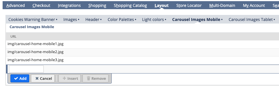
What we need to do is add two new sub-tabs to the configuration record page where administrators can add their images for mobile and tablet devices.
{
  "properties":
  {
    "home.carouselImagesMobile":
    {
      "group": "layout"
    , "type": "array"
    , "title": "Carousel Images Mobile"
    , "description": "Carousel Image URLs for Mobile Devices"
    , "items":
      {
        "type": "string"
      , "title": "URL"
      }
    , "default": []
    }
  , "home.carouselImagesTablet":
    {
      "group": "layout"
    , "type": "array"
    , "title": "Carousel Images Tablet"
    , "description": "Carousel Image URLs for Tablet Devices"
    , "items":
      {
        "type": "string"
      , "title": "URL"
      }
    , "default": []
    }
  }
}
Deploy, Activate and Test
Save all your files and push them up to NetSuite. You’ll obviously need to activate it. Once that’s all done, you’ll need to go the file cabinet and navigate to the img folder for your site’s SSP and upload some images there (eg three for tablet and three for mobile), and then you’ll need to modify the configuration record and put those values in their respective arrays (eg Layout > Carousel Images Tablet and Layout > Carousel Images Mobile).
If you save the configuration record, the only thing left to do is to test!
Resize your site’s viewport and and then refresh. If it’s within the viewport width of one of the device types, it will show different images. Here’s the example:
