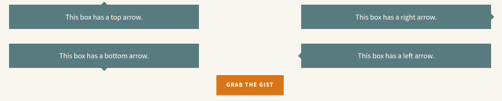
if we need to created arrow as shown in below Screenshots, in any div we can follow the below code
Here we have a Example
HTML Code
<div class=”c-box c-box–arrow-top”>
This box has a top arrow.
</div>
<div class=”c-box c-box–arrow-right”>
This box has a right arrow.
</div>
<div class=”c-box c-box–arrow-bottom”>
This box has a bottom arrow.
</div>
<div class=”c-box c-box–arrow-left”>
This box has a left arrow.
</div>
<footer class=”c-footer”>
<a class=”c-btn” href=”” target=”_blank”>Grab the Gist</a>
</footer>
CSS Code
/* This mixin is for generating CSS arrows on a box */
@mixin box-arrow($arrowDirection, $arrowColor, $arrowSize: 10px) {
position: relative;
z-index: 10;
&::after {
content: ”;
width: 0;
height: 0;
display: block;
position: absolute;
z-index: 10;
border: 0;
@if $arrowDirection == bottom or $arrowDirection == top {
border-left: $arrowSize solid transparent;
border-right: $arrowSize solid transparent;
margin-left: -$arrowSize;
left: 50%;
@if $arrowDirection == bottom {
border-top: $arrowSize solid $arrowColor;
bottom: -$arrowSize;
}
@if $arrowDirection == top {
border-bottom: $arrowSize solid $arrowColor;
top: -$arrowSize;
}
}
@if $arrowDirection == left or $arrowDirection == right {
border-top: $arrowSize solid transparent;
border-bottom: $arrowSize solid transparent;
margin-top: -$arrowSize;
top: 50%;
@if $arrowDirection == left {
border-right: $arrowSize solid $arrowColor;
left: -$arrowSize;
}
@if $arrowDirection == right {
border-left: $arrowSize solid $arrowColor;
left: auto;
right: -$arrowSize;
}
}
}
}
// set some variables to reuse
$boxbkg: #587b7f;
$bodybkg: #f9f6ef;
$btncolor: #d87517;
body {
display: flex;
flex-wrap: wrap;
justify-content: space-around;
padding: 5vmin;
margin: 0;
font-family: ‘Source Sans Pro’, sans-serif;
background: $bodybkg;
}
.c-header {
width: 100%;
text-align: center;
font-size: calc(100% + 1vmin);
h1 {
font-weight: 700;
color: #333;
}
}
.c-box {
background: $boxbkg;
font-size: 150%;
text-align: center;
color: #fff;
flex-basis: 30%;
padding: 5vmin;
margin: 5vmin;
&–arrow-top {
@include box-arrow(top, $boxbkg);
}
&–arrow-right {
@include box-arrow(right, $boxbkg);
}
&–arrow-bottom {
@include box-arrow(bottom, $boxbkg);
}
&–arrow-left {
@include box-arrow(left, $boxbkg);
}
}
.c-footer {
width: 100%;
text-align: center;
}
.c-btn {
background: $btncolor;
display: inline-block;
color: #fff;
font-weight: 700;
text-decoration: none;
text-transform: uppercase;
letter-spacing: .1em;
padding: .75em 1.5em .85em;
font-size: 120%;
line-height: 140%;
border-radius: 2px;
border: 3px solid $btncolor;
box-shadow: 0 4px 0 0 rgba(0,0,0,.1);
transition: .2s all ease-out;
&:hover {
color: $btncolor;
background: #fff;
box-shadow: 0 6px 0 0 rgba(0,0,0,.2);
border: 3px solid $btncolor;
}
}