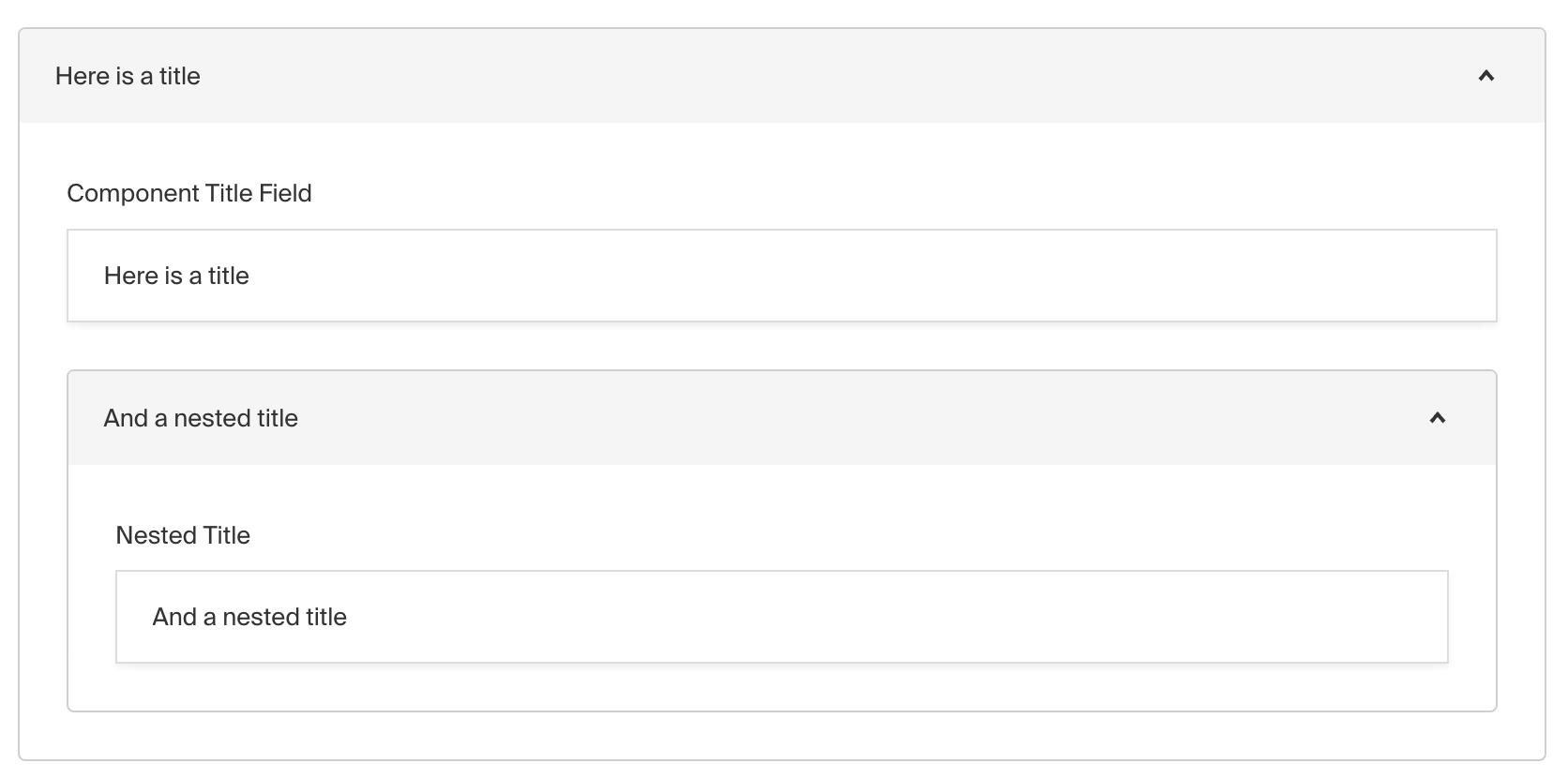
The Collapsible field is presentational-only and only affects the Admin panel. By using it, you can place fields within a nice layout component that can be collapsed / expanded.
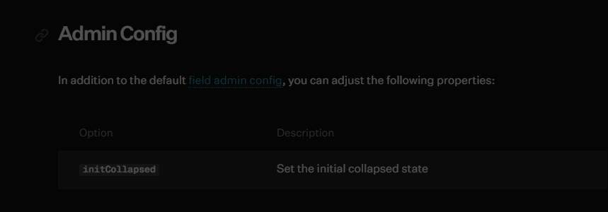
Admin Config
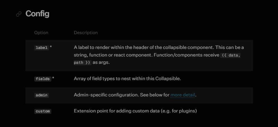
Example
collections/ExampleCollection.ts
import { CollectionConfig } from 'payload/types'


export const ExampleCollection: CollectionConfig = {
  slug: 'example-collection',
  fields: [
    {
      label: ({ data }) => data?.title || 'Untitled',
      type: 'collapsible', // required
      fields: [
        // required
        {
          name: 'title',
          type: 'text',
          required: true,
        },
        {
          name: 'someTextField',
          type: 'text',
          required: true,
        },
      ],
    },
  ],
}