Responsive coding in SuiteCommerce ensures that the website adjusts seamlessly to different screen sizes and device types. As a modern e-commerce platform, SuiteCommerce offers responsive themes and components out of the box, but implementing customized responsive designs ensures that unique elements, custom layouts, and branding maintain consistency across all screen sizes.
Breakpoints are specific screen widths at which your layout changes to accommodate different device sizes. SuiteCommerce’s SCSS setup provides a convenient way to define and manage breakpoints with variables, so you only need to adjust screen size values once to apply them consistently across the site.
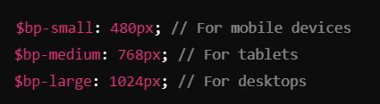
Defining Breakpoints: SCA typically uses three main breakpoints: mobile, tablet, and desktop, though more specific breakpoints can be added based on requirements. These breakpoints ensure that the site adjusts correctly to different screen sizes and orientations.
- Commonly used breakpoints might look like this:
- Once defined, you can apply these breakpoints through SCSS media queries, which are conditional rules specifying styles based on screen width.
Using Media Queries: Media queries allow you to set conditions for different styles at specific breakpoints. For example, you might want to reduce padding and change font sizes on mobile to improve readability. Here’s how to apply these breakpoints: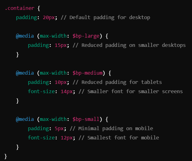
- This use of media queries ensures that each layout element—padding, font size, margins, etc.—adjusts smoothly, creating a comfortable viewing experience on all screen sizes.
Using breakpoints, SuiteCommerce Advanced can be highly adaptable to any device. The combination of these responsive coding practices provides a strong foundation for creating visually appealing, mobile-friendly designs in SuiteCommerce Advanced.