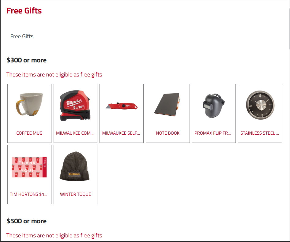
In SCA websites, typically four items are displayed per row on PLP pages. To include more items as per the requirements from clients, we need to resize the item names, images, and the entire item cells.
To reduce or restrict the display of lengthy item name we use the ellipsis feature in CSS. Below provided are the sample CSS style properties to implement 3 dots at the end of lengthy item name.
text-overflow: ellipsis;
overflow: hidden;
display: -webkit-box;
-webkit-line-clamp: 2;
-webkit-box-orient: vertical;
white-space: normal;
To reduce the size of item cells, we can use bootstrap classes in the template file.
<div class=“col-md-4 col-md-offset-8”>
<Section class=“free-item-section”>The item will be free if the total order exceeds {{thresholdprice}}</Section>
</div>
The result will look as follows.