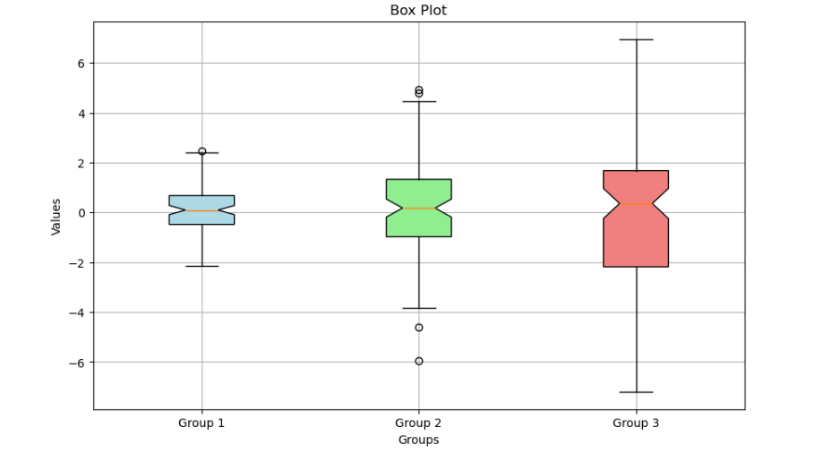
A box plot, also known as a box-and-whisker plot, is a graphical representation used in data visualization to show the distribution of a dataset. It provides a summary of a dataset’s central tendency, dispersion, and skewness. Here’s how it works:
- Box Components:
- Box: Represents the interquartile range (IQR), which contains the middle 50% of the data. The box is drawn from the first quartile (Q1) to the third quartile (Q3).
- Median: A line inside the box represents the median (the middle value of the data). This line divides the box into two parts, indicating the central tendency of the data.
- Whiskers:
- Lower Whisker: Extends from the lower edge of the box to the smallest data point within 1.5 times the IQR below Q1.
- Upper Whisker: Extends from the upper edge of the box to the largest data point within 1.5 times the IQR above Q3.
- Outliers:
- Outliers: Data points that fall outside the range defined by the whiskers (i.e., beyond 1.5 times the IQR from Q1 and Q3) are considered outliers and are often plotted as individual points.
- Usage:
- Comparing Distributions: Box plots are particularly useful for comparing the distributions of multiple datasets side-by-side.
- Identifying Skewness: The position of the median line within the box can indicate skewness. If the median is closer to the top or bottom of the box, it suggests skewness.
- Detecting Outliers: Box plots easily highlight outliers, providing insights into unusual data points.
Example Code:
import matplotlib.pyplot as plt
import numpy as np
# Sample data
np.random.seed(10)
data = [np.random.normal(0, std, 100) for std in range(1, 4)]
fig, ax = plt.subplots(figsize=(10, 6))
# Creating a box plot
box = ax.boxplot(data, patch_artist=True, notch=True, vert=True,
labels=[‘Group 1’, ‘Group 2’, ‘Group 3’])
# Adding colors and customizations
colors = [‘lightblue’, ‘lightgreen’, ‘lightcoral’]
for patch, color in zip(box[‘boxes’], colors):
patch.set_facecolor(color)
# Adding title and labels
ax.set_title(‘Complex Box Plot’)
ax.set_xlabel(‘Groups’)
ax.set_ylabel(‘Values’)
# Adding grid and showing plot
ax.grid(True)
plt.show()
Example Output: