Creating a dashboard for data science involves designing a visual interface to present data insights and analytics effectively. Dashboards consolidate multiple data visualizations into a single interactive view, making it easier to monitor key metrics and trends. Here’s a comprehensive guide to creating a dashboard for data science:
1. Define the Purpose and Audience
Before starting, clearly define the purpose of the dashboard and the needs of the target audience. Consider what metrics and data points are important, and how the dashboard will be used. Common purposes include:
- Monitoring performance metrics
- Analyzing trends
- Reporting results
- Making data-driven decisions
2. Choose the Right Tools
Several tools are available for creating data dashboards, each with its own strengths:
- Python Libraries: Dash by Plotly, Streamlit, Bokeh
- Web-based Tools: Tableau, Power BI, Google Data Studio
- JavaScript Libraries: D3.js, Chart.js
For this guide, we’ll focus on creating dashboards using Python libraries like Dash and Streamlit.
3. Data Preparation
Ensure your data is clean, well-structured, and ready for analysis. This involves:
- Data Cleaning: Handling missing values, outliers, and inconsistencies.
- Data Transformation: Aggregating, filtering, and reshaping data as needed.
- Data Integration: Combining data from multiple sources if required.
4. Designing the Dashboard
Consider the following design principles:
- Simplicity: Avoid clutter. Include only the most relevant visualizations and metrics.
- Clarity: Use clear labels, titles, and legends.
- Interactivity: Allow users to filter and drill down into data.
- Consistency: Use a consistent color scheme and layout.
5. Creating Dashboards with Python
Using Dash by Plotly
Dash is a Python framework for building analytical web applications. It integrates with Plotly for creating interactive graphs.
example code:
import dash
from dash import dcc, html
from dash.dependencies import Input, Output
import pandas as pd
import plotly.express as px
# Load the data using pandas
data = pd.read_csv(‘https://cf-courses-data.s3.us.cloud-object-storage.appdomain.cloud/IBMDeveloperSkillsNetwork-DV0101EN-SkillsNetwork/Data%20Files/historical_automobile_sales.csv’)
# Initialize the Dash app
app = dash.Dash(__name__)
# Create the layout of the app
app.layout = html.Div([
html.H1(
“Automobile Sales Statistics Dashboard”,
style={‘textAlign’: ‘center’, ‘color’: ‘#503D36’, ‘font-size’: 24}
),
html.Div([
html.Label(“Select Statistics:”),
dcc.Dropdown(
id=’dropdown-statistics’,
options=[
{‘label’: ‘Yearly Statistics’, ‘value’: ‘Yearly Statistics’},
{‘label’: ‘Recession Period Statistics’, ‘value’: ‘Recession Period Statistics’}
],
placeholder=’Select a report type’,
value=’Yearly Statistics’,
style={‘width’: ‘80%’, ‘padding’: ‘3px’, ‘font-size’: ’20px’, ‘text-align-last’: ‘center’}
),
html.Label(“Select Year:”),
dcc.Dropdown(
id=’select-year’,
options=[{‘label’: i, ‘value’: i} for i in range(1980, 2024)],
placeholder=’Select a year’,
value=None
)
]),
html.Div([
html.Div(id=’output-container’, className=’chart-grid’, style={‘display’: ‘flex’}),
]),
])
# Callback to enable/disable input container based on selected statistics
@app.callback(
Output(component_id=’select-year’, component_property=’disabled’),
Input(component_id=’dropdown-statistics’, component_property=’value’)
)
def update_input_container(selected_statistics):
return selected_statistics != ‘Yearly Statistics’
# Callback for plotting
@app.callback(
Output(component_id=’output-container’, component_property=’children’),
[Input(component_id=’select-year’, component_property=’value’),
Input(component_id=’dropdown-statistics’, component_property=’value’)]
)
def update_output_container(input_year, selected_statistics):
if selected_statistics == ‘Recession Period Statistics’:
recession_data = data[data[‘Recession’] == 1]
# Plot 1: Automobile sales fluctuate over Recession Period (year wise)
yearly_rec = recession_data.groupby(‘Year’)[‘Automobile_Sales’].mean().reset_index()
R_chart1 = dcc.Graph(
figure=px.line(
yearly_rec,
x=’Year’,
y=’Automobile_Sales’,
title=”Average Automobile Sales fluctuation over Recession Period”
)
)
# Plot 2: Calculate the average number of vehicles sold by vehicle type
average_sales = recession_data.groupby(‘Vehicle_Type’)[‘Automobile_Sales’].mean().reset_index()
R_chart2 = dcc.Graph(
figure=px.bar(
average_sales,
x=’Vehicle_Type’,
y=’Automobile_Sales’,
title=”Average Number of Vehicles Sold by Vehicle Type during Recession”
)
)
# Plot 3: Pie chart for total expenditure share by vehicle type during recessions
exp_rec = recession_data.groupby(‘Vehicle_Type’)[‘Advertising_Expenditure’].sum().reset_index()
R_chart3 = dcc.Graph(
figure=px.pie(
exp_rec,
values=’Advertising_Expenditure’,
names=’Vehicle_Type’,
title=”Total Expenditure Share by Vehicle Type during Recessions”
)
)
# Plot 4: Bar chart for the effect of unemployment rate on vehicle type and sales
unemployment_effect = recession_data.groupby([‘Vehicle_Type’, ‘unemployment_rate’])[‘Automobile_Sales’].mean().reset_index()
R_chart4 = dcc.Graph(
figure=px.bar(
unemployment_effect,
x=’Vehicle_Type’,
y=’Automobile_Sales’,
color=’unemployment_rate’,
title=”Effect of Unemployment Rate on Vehicle Type and Sales during Recessions”
)
)
return [
html.Div(className=’chart-item’, children=[html.Div(children=R_chart1), html.Div(children=R_chart2)]),
html.Div(className=’chart-item’, children=[html.Div(children=R_chart3), html.Div(children=R_chart4)])
]
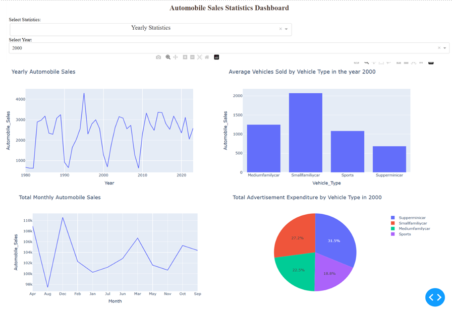
elif input_year and selected_statistics == ‘Yearly Statistics’:
yearly_data = data[data[‘Year’] == input_year]
# Plot 1: Yearly Automobile sales using line chart for the whole period.
yas = data.groupby(‘Year’)[‘Automobile_Sales’].mean().reset_index()
Y_chart1 = dcc.Graph(
figure=px.line(
yas,
x=’Year’,
y=’Automobile_Sales’,
title=”Yearly Automobile Sales”
)
)
# Plot 2: Total Monthly Automobile sales using line chart.
total_monthly_sales = data.groupby(‘Month’)[‘Automobile_Sales’].sum().reset_index()
Y_chart2 = dcc.Graph(
figure=px.line(
total_monthly_sales,
x=’Month’,
y=’Automobile_Sales’,
title=”Total Monthly Automobile Sales”
)
)
# Plot 3: Bar chart for average number of vehicles sold during the given year
avr_vdata = yearly_data.groupby(‘Vehicle_Type’)[‘Automobile_Sales’].mean().reset_index()
Y_chart3 = dcc.Graph(
figure=px.bar(
avr_vdata,
x=’Vehicle_Type’,
y=’Automobile_Sales’,
title=f”Average Vehicles Sold by Vehicle Type in the year {input_year}”
)
)
# Plot 4: Total Advertisement Expenditure for each vehicle using pie chart
exp_data = yearly_data.groupby(‘Vehicle_Type’)[‘Advertising_Expenditure’].sum().reset_index()
Y_chart4 = dcc.Graph(
figure=px.pie(
exp_data,
values=’Advertising_Expenditure’,
names=’Vehicle_Type’,
title=f”Total Advertisement Expenditure by Vehicle Type in {input_year}”
)
)
return [
html.Div(className=’chart-item’, children=[html.Div(children=Y_chart1), html.Div(children=Y_chart2)]),
html.Div(className=’chart-item’, children=[html.Div(children=Y_chart3), html.Div(children=Y_chart4)])
]
else:
return None
# Run the Dash app
if __name__ == ‘__main__’:
app.run_server(debug=True, port=8051)
Conclusion
Creating a dashboard involves defining the purpose, choosing the right tools, preparing the data, designing an intuitive layout, and deploying the final product. Using Python libraries like Dash and Streamlit can simplify the process of creating interactive and insightful dashboards, helping you effectively communicate data-driven insights.