Adding an Expander
The only changes required are to the template and Sass.
First, you should start by creating a container element for your expander. This needs to contain two children: a ‘head’ element, which is what always shows and will trigger the expansion when clicked, and a ‘body’ element which is what shows when the content is expanded. It is fine to use div elements for these.
In the ‘head’ element, add an anchor tag with the following:
class="collapsed"— indicates to the JavaScript that the expander starts collapsed (you will need to add in additional classes for styling later)data-toggle="collapse"— to inform the built-in JavaScript that this is an expanderdata-target="#yourId"— this points the JavaScript to which element should be expanded; note that#yourIdshould be an ID on the ‘body’ element
The anchor tag can then contain the prompt text you always want to show the user.
On the ‘body’ element, add:
class="collapse"— used to track the status of whether it is collapsed, collapsing/expanding, or expandedid="yourId"— this must match thedata-targetvalue on the ‘head’ element (but without the#)data-target="#yourId"— this must match thedata-targetvalue on the ‘head’ element
To give you an idea of how this should look, here is an example:
<div class="home-summary-expander-container">
    <div class="home-summary-expander-head">
        <a class="home-summary-expander-head-toggle collapsed" data-toggle="collapse" data-target="#home-summary-body" aria-expanded="false" aria-controls="home-expander">
            Click me! <i data-toggle="tooltip" class="home-summary-expander-tooltip" title="Click this thing" ></i><i class="home-summary-expander-toggle-icon"></i>
        </a>
    </div>
    <div class="home-summary-expander-body collapse" id="home-summary-body">
        <div class="home-summary-expander-container">
            <p>Hi there</p>
        </div>
    </div>
</div>
I included some additional elements and classes for styling, look-and-feel, and accessibility.
For styling, you can extend some built-in styles, eg:
.home-summary-expander-container {
    padding: $sc-base-padding * 3;
    clear:both;
}
.home-summary-expander-head {
    @extend .accordion-head;
}
.home-summary-expander-head-toggle{
    @extend .accordion-head-toggle;
}
.home-summary-expander-toggle-icon{
    @extend .accordion-toggle-icon;
}
.home-summary-expander-body{
    @extend .accordion-body-alt;
}
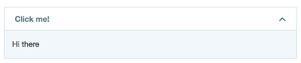
The result is something like this:
As with a lot of these molecules, refer to our code for examples of where we have used them and how to use them appropriately.