Pie charts are a popular type of data visualization used to represent the proportions of different categories within a whole. Each slice of the pie represents a category, with the size of each slice proportional to the category’s percentage of the total. They are best used for displaying relative proportions rather than exact values.
Key Features of Pie Charts
- Slices: Each slice represents a category, and its size is proportional to its percentage of the total.
- Colors: Different slices are often colored differently to distinguish between categories.
- Labels: Labels can be added to slices to show category names and percentages.
Creating a Pie Chart Using Matplotlib in Python
Matplotlib is a widely used library in Python for creating static, animated, and interactive visualizations. Below is an example of how to create a pie chart using Matplotlib.
Example Code:
import matplotlib.pyplot as plt
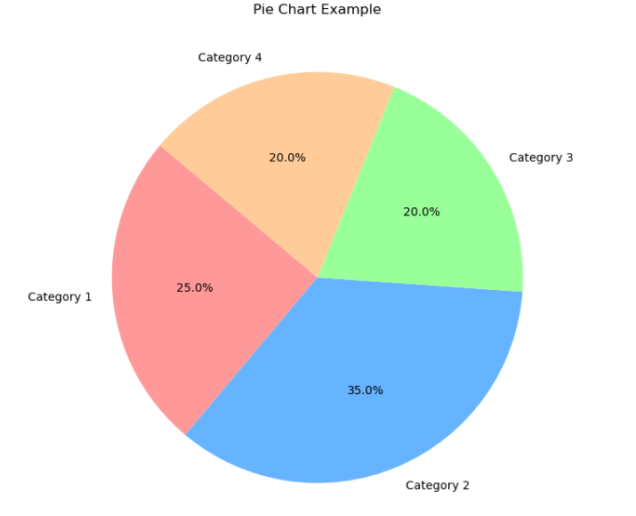
# Sample data
categories = [‘Category 1’, ‘Category 2’, ‘Category 3’, ‘Category 4’]
sizes = [25, 35, 20, 20] # Percentage of each category
colors = [‘#ff9999′,’#66b3ff’,’#99ff99′,’#ffcc99′] # Custom colors
# Creating a pie chart
plt.figure(figsize=(8, 8)) # Adjust the figure size
plt.pie(sizes, labels=categories, colors=colors, autopct=’%1.1f%%’, startangle=140)
# Adding title
plt.title(‘Pie Chart Example’)
# Show plot
plt.show()
Use Cases for Pie Charts
- Market Share: Showing the market share of different companies.
- Budget Allocation: Visualizing the allocation of a budget across different departments.
- Survey Results: Displaying the proportion of responses in different categories.
Conclusion
Pie charts are a straightforward and effective way to represent proportional data. They are most useful for providing a quick visual impression of the relative sizes of parts of a whole. By using libraries like Matplotlib, you can create clear and aesthetically pleasing pie charts to help convey your data insights effectively.