If the user needs to display different kinds of KPI data in a single graphical representation, then use the Trend Graph. We have different options like Area, Line, Bar, and Column chart representations.

To add a Trend Graph portlet:
- Click Personalize in the upper right corner of your dashboard or use Personalize Dashboard in the Settings portlet.
- On the Standard Content tab of the Personalize Dashboard palette, click the Trend Graph icon or drag it onto the dashboard.
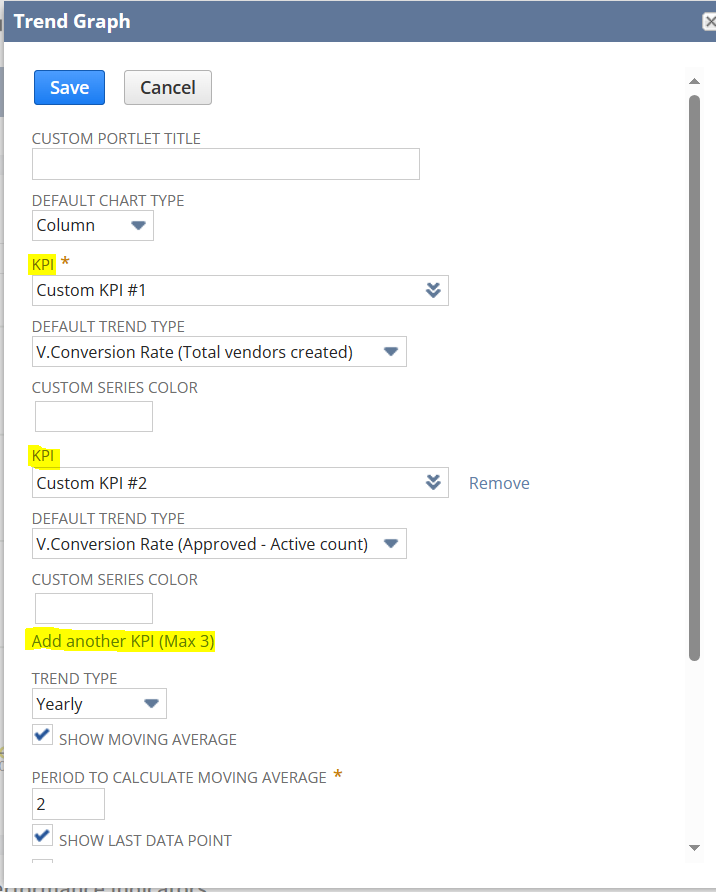
- Click Set Up in the portlet or in the portlet menu and use the KPI list to select the KPI to be used for this trend graph. You can select up to three.
You can set the time period for trend graph data.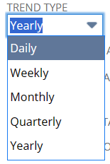
You can add multiple KPIs by clicking ‘Add another KPI‘.
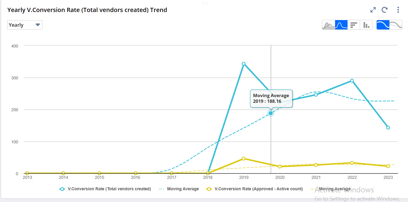
Given below the example of the trend graph with two KPIs included in the trend graph